Since the first emblem
Target driven
Two words that decide everything we make, and most of what we decide not to.
The idea
A logo that belongs to the sport
Most sportswear puts the same badge on every garment and lets the colour do the work. We wanted the opposite.
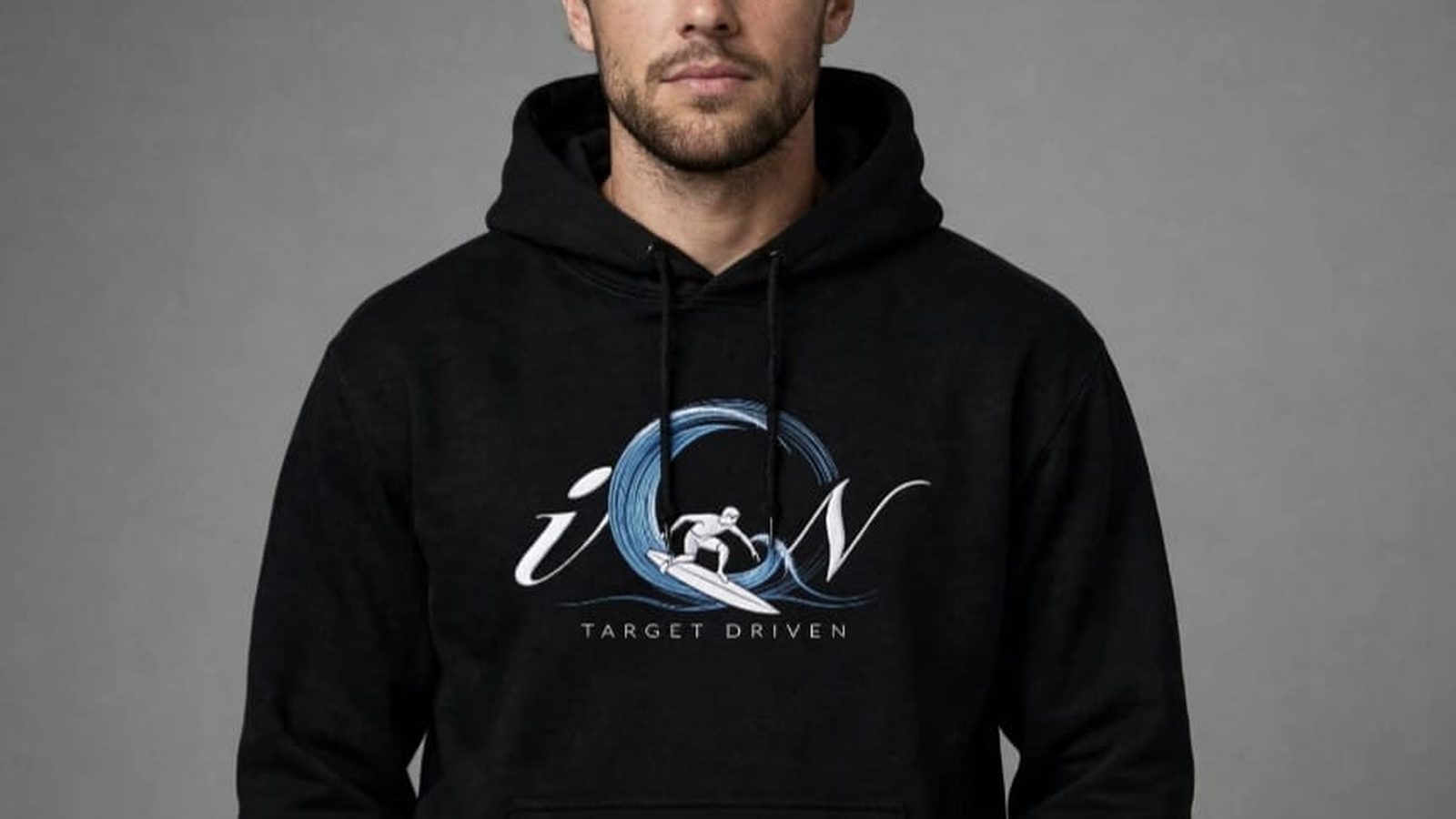
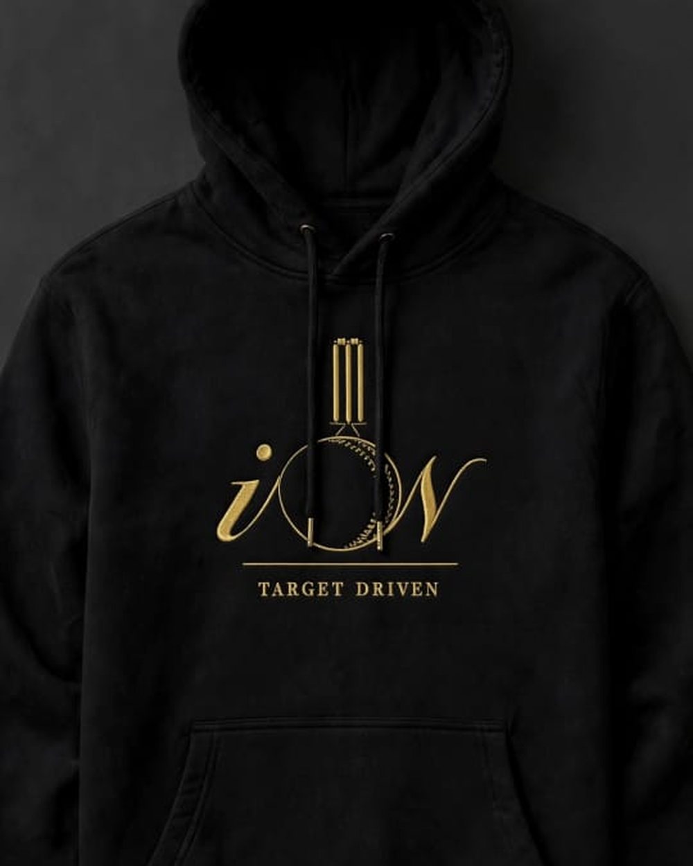
The iON wordmark was drawn with a hollow centre on purpose. That centre — the O — is where the discipline lives. On a tennis piece it becomes a strung racket face. On golf, a dimpled ball with the green horizon beneath it. On cricket, stumps above the seam, struck in antique gold. Surf gets the curl of a barrel. Equestrian clears an oxer.
The result is a family of marks that reads as one house from across a room, and as your sport from close up. An athlete should not have to explain what they play. The emblem does it.
Our mission
To make sportswear that belongs to the athlete who wears it. Precision crafted, performance tested, purpose built — with a considered emblem for every discipline, and within reach of every level of the game.
Our vision
To become Africa's leading luxury sports brand — where every athlete, at every level, can dress target driven.
The making
Weight you can feel
Nothing in the range is a promotional blank with a print dropped on it. Fleece is 380 gsm with a brushed back. Jersey is 220 gsm combed ringspun cotton. Both are garment-washed before they reach you so the drape is settled and the shrink is already out.
Emblems are screen printed soft-hand and cured properly, so they flex with the fabric instead of cracking across the chest after a winter of wear. The gold pieces — cricket and equestrian — use a warm antique tone rather than a bright metallic, because bright metallic looks expensive for about three washes.
Shop the collectionThe houses
Twelve disciplines under one roof
Each with its own emblem, its own pieces and its own page. Start wherever you play.